In many topics of visualization studied in Professor Ito's Laboratory, there are a number of applications related to social science. This page introduces our visualization research themes, which are closely linked to this study area.
|
|
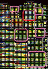
Theft, forgery and abuse of credit cards have been serious social problems.
Especially in recent years, cases involving credit cards abuse using tricky techniques like skimming have risen considerably,
so the establishment of robust technologies are eagerly anticipated to minimize the damages.
|
- A. Nagasaki, T. Itoh, M. Ise, K. Miyashita, A Correlation-based Hierarchical Data Visualization Technique and Its Application to Credit Card Fraud Data, 1st International Workshop on Super Visualization, 2008. (PDF)
|
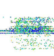
There are an increasing number of people who try malicious intrusions and attacks to the computer networks.
Serious situations like service interference of online shopping, and leak of official secrets of the companies or municipalities are reported.
A real-time detective system is expected to be developed in order to minimize the damages from the malicious attacks.
|
|
- M. Kikuchi, T. Itoh, A Visualization Technique for Monitoring of Network Flow Data, 1st International Symposium on Information and Computer Elements (ISICE), pp. 291-296, 2007. (PDF)
- T. Itoh, H. Takakura, A. Sawada, K. Koyamada, Hierarchical Visualization of Network Intrusion Detection Data in the IP Address Space, IEEE Computer Graphics and Applications, Vol. 26, No. 2, pp. 40-47, 2006. (PDF)
|
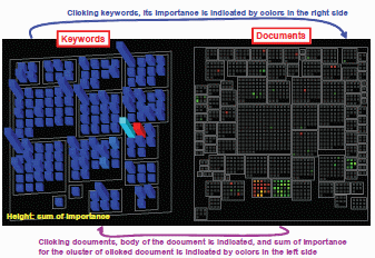
Extracting a trend and tendency from large amount of documents is useful in many areas.
For example, extracting related documents from series of newspaper articles,
and common techniques from academic papers and patent application documents seem to be valuable.
|
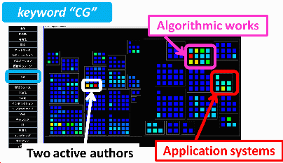
- H. Tachibana, T. Itoh, Visualization of Corpus Data by a Dual Hierarchical Data Visualization Technique, IEEE Pacific Visualization Symposium, 2008. (PDF)
|
Architects and managers of websites, and also people who are involved in internet businesses
always pay attention to the facts that what type of people are interested and how they browse the websites.
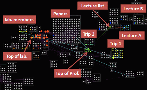
We have focused on major routine access patterns and are developing their visualisation method.
|
|
- M. Kawamoto, T. Itoh, A Visualization Technique for Access Patterns and Link Structures of Web Sites, 14th International Conference on Information Visualisation (IV10), 2010.
|
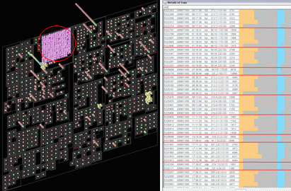
In many workplaces, they figure out the project progress as a great number of tasks.
It enables us to evaluate the rationality of each task by observing the progress structurally.
|
- Y. Uchida, T. Itoh, A Visualization Technique for Hierarchical Time Series Task Data, 1st International Symposium on Information and Computer Elements (ISICE), pp. 279-284, 2007. (PDF)